Showing posts with label Instruction. Show all posts

July 5, 2011

Composing Awesome Portraits - Adorama TV

I've been MIA for a month or so and haven't posted anything! I'm working on some pretty amazing projects (you can see the genesis of one here: http://www.furiousjourney.com) including a new home for my images.
I wanted to share this short instructional video from Adorama with some good tips on how to frame better portraits. There are some good tips.


April 25, 2011

18 Thoughts on Breaking Creative Blocks

 A great article about what 18 creatives do to overcome creative block.

 http://lukecopping.com/blog/index.php/18-creative-thinkers-break-your-artistic-stall/

April 13, 2011

This Lens is Soft...and Other Myths

 I consider this article the definitive statement on lenses/bodies being soft.
It is a phenomenal article and I recommend you follow the link at the end and read the rest. You will never look at lenses the same way again. This is not an article I have written and I claim no credit, I just liked it so much that it needed to be reposted.

“This Lens is Soft”...and other Myths

CR Introduction
Welcome aboard Roger Cicala from LensRentals.com. He has been kind enough to allow us to republish some of his fine technical articles. You’ll find his writing easy to read, often humorous and generally right on the ball.
I chose this article first because I am constantly asked about this phenomenon. It’s also talked about quite frequently on message boards.
So sit back and enjoy the read.

Part 1 – Written in 2008

One of the most common examples of anti-logic we see at LensRentals is the statement The lens is soft/frontfocuses/backfocuses. Now don’t get me wrong, there are bad copies of lenses out there, as best we can tell ranging from 3% to 7% of lenses. And we know, despite our checkout procedures, that 1 of 400 lenses or so will be damaged in shipping and arrive not functioning. Sometimes there’s actual damage or misalignment of an element in the lens, although the vast majority of the time that’s not the case. Usually the subject of the photograph is soft because the lens is not focusing precisely.
Three to 4 times a week we have the following conversation:
“The lens you sent me frontfocuses, its not good.”
“OK, we’ll overnight you a replacement.”
Then the first lens comes back and its perfectly fine when we check it out. But the customer is very happy with the replacement lens, it worked great even thought the first one didn’t. So what has happened? Its rather simple, actually, and like most examples of anti-logic it stems from a wrong assumption: the customer knows his/her camera is ‘fine’ because it works with fine with their other lenses—none of them front focus or back focus.
The key to the puzzle is the definition of ‘fine’. Most people assume that ‘fine’ means ‘perfectly calibrated’. In reality cameras are like any other manufactured item, calibration is within a given tolerance range. We don’t have privvy to what the actual tolerance range Canon, Nikon, or the other manufacturers (except Zeiss and Leica) consider acceptable, so lets arbitrarily say the manufacturer will consider a camera or lens to be ‘in specifications’ if its + or – 3 ‘focus units’ from perfect. We can assume they reached this number because anything within + or – 3 focus units will be within the depth of field of a wide aperture (probably f/2.8) lens.
Lets consider that I have a camera body that is -2 focus units from perfect, and a lens that is +2 focus units from perfect. Both are considered ‘fine’ according to the manufacturers definition, although they certainly aren’t perfect. However, the combination of a +2 lens on my -2 camera will be absolutely perfect, I’ll love the lens on my camera . After my experience with this one lens on one camera, I will write Sonnets on the various online forums about how great it is, and will tell anyone who doesn’t like it that they must be a bad photographer. I will have become the most dreaded online lifeform, a FLAO (Fanboy with Loss of All Objectivity).
But what if the lens was -2 focus units from the theoretical perfect and I put it on my -2 focus units from perfect camera? Well it depends. If the lens is say an f/4 maximum aperture, probably not much: the depth of field from an f/4 aperture lens may well mask a bit of front focusing or back focusing. You might notice the lens frontocuses 3 feet in front of the subject at 20 feet if you pixel peep, but since the depth of field is 10 feet the subject is still in focus and the lens seems fine. I will probably describe the lens as very good, but not descend to complete FLAOdom.
But if its an f/1.4 lens with a very shallow depth of field, the front focusing will be noticeable: the subject will be out of focus and soft. If I know how to do a front/backfocus test I may have figured out the problem, but here’s the kicker: if I sent the lens in to the manufacturer to fix the problem they would check the lens out, say it was fine (because it is fine, its within specifications) and send it back. Ony if I send the camera and lens together to be calibrated would the fact that the two together are out of focus be apparent, and then the manufacturer would be able to fix the calibration...

Follow the link below to read the rest of the article.
http://www.canonrumors.com/tech-articles/this-lens-is-soft-and-other-myths/

March 31, 2011

Sometimes It's an Accident

What was supposed to be a happy, fun, quick shoot with my Hannah (basically documenting her prominent shiner) produced a photo that has been very powerful for me. It makes me think of all the children who are the subjects of domestic abuse and simply have no voice. Anyone who knows me knows that I don't like to be a downer but sometimes an image touches you and that's art is truly doing its job. The impact of this image is almost entirely due to the post-processing. Hannah was certainly not in pain or even upset. I'm not sure why she was covering her mouth but somehow in post when I darkened and desaturated, it brought out this image.


{Photo IQ: The simple lesson of this image is to play around. Allow yourself to explore and experiment with images in post. You just never know what you're going to get! In this case, I desaturated and upped the contrast. It really wasn't too much, but it brought out the black eye and the higher contrast made the catchlights stand out more, giving the impression of nearly crying.
I've posted the original image below so you can see the real differences brought on by allowing some fun in Photoshop. What are your thoughts? Can true art happen accidentally?}

March 17, 2011

Pictage User Group - Salt Lake City

I am the speaker at the Pictage User Group on March 30!
The program will be unique and a lot of fun. I have extensive experience with improv comedy and have noticed some very strong ties between the creativity required to do improv and the creativity of photography. We will entertain, inform and inspire, don't miss it!
It is sponsored by Pictage but everyone is invited.

We will be meeting on March 30th at 6:30 p.m. in the Salt Lake City Library.  The program starts at promptly at 7:00 p.m.
210 East 400 South
Salt Lake City UT 84111

Please join us.  It is free for anyone to attend and any experience level is welcome! If you have questions you may email andrea@andreahanksphotography.com or call her at 801-349-0718.

January 13, 2011

Macro Photography on a Budget - Thank you, Pringles!


The image below is a half-burned match shot with a jimmy-rigged lens made out of a Pringles can!
I haven't had a chance to try it yet, but I will, oh yes, I will.


Go catch the whole article at: http://www.pixiq.com/article/macro-photography-on-a-budget 
Here is a gallery of photos shot with this very setup: http://professorbikeybike.com/fotos/macro

December 14, 2010

Chelsea Lindsay - Head shots

portrait-head-shot-utah-photography

portrait-head-shot-utah-photography

portrait-head-shot-utah-photography

Chelsea is a music student at the University of Utah.  In preparation for some upcoming auditions, she came to me for some headshots. Operas are not known for their wild and crazy head shots so she wanted something low-key and professional. We did pretty standard lighting for the first set, then went a little more glamorous (lighting-wise) on the second half. Chelsea is an incredibly talented vocalist but she also has a thing for pop culture We had the time of our lives spouting movie lines and trading obscure factoids. In the end, I feel like we got a traditional head shot feel and she looked amazing! Thanks again, Chelsea, for sharing your awesomeness!

For those of you on smart phones who can't see the slideshow below, click here to be whisked electronically to the facebook album.


{PHOTO IQ: Using rim light in portraits. The rim light/back light/separator light is one of the most important pieces in a portrait. it gives it depth and shape, helps the subject stand out, and allows the photographer to sculpt the face in the best possible way. I played around a lot with the back light in this shoot. Some have it, some don't. In the example below, you'll see how much more pop there is in the top image with the background light bringing out her shoulders and shaping her hair against the black background. The back light in this set was a speedlite with a Honl gird on it to reduce flare. As you go through the images, pay attention to the role of the back light. Try to pick out the angle at which it's hitting the subject and whether that angle works for Chelsea's face and for the feel of the shots.}


See more at www.jonwoodbury.com

November 23, 2010

Lauren Betts - Baby Girl

ALTERNATIVE PHOTO DESCRIPTION HERE

ALTERNATIVE PHOTO DESCRIPTION HERE

ALTERNATIVE PHOTO DESCRIPTION HERE

Lisa and Scott have a nice sized family. For several years the happy bunch consisted of mom, dad, and three boys. Three boys. Poor Lisa. Lisa, the lone woman in a house of men. Trucks, blocks, and action figures littered her life.

Surprise! This year, little Lauren came along! Lisa finally has a chance to buy pink, tie bows, and capture the fun of the first little girl in the gang. I was thrilled to be able to capture some classic photos of sweet Lauren, both on her own as well as with mom and each of her big brothers. I have a feeling that this gorgeous little girl is going to be well loved and protected as she grows. Heaven help the boy that comes to the door when she turns 16 when she has bodyguards like these! What a great family!

{PHOTO IQ: A couple of tips for shooting babies that I would pass on. First off, turn up the thermostat so it's nice and warm. You'll get happier babies. Secondly, be prepared to deal with messes. It's a simple equation, babies eat, cry, and poop. Since you aren't feeding them, and you don't want the crying, you have to be prepared for the third alternative. We had a couple of covers for the basket and plastic underneath. It was not enough. Little Lauren still projectile pooped across the room. Of course, her mother was embarrassed but we reassured her that it was common and we'd prepared for it. It only delayed the shoot for a few minutes and we had a good laugh!
So to recap: Warm and poop.}

For those of you on smart phones who can't see the slideshow below, click here to be whisked electronically to the facebook album.


See more at www.jonwoodbury.com

November 10, 2010

Jamison & Amy Part I - Salt Flats Engagement Session


Salt-flats-engagement-photography-summer


Salt-Flats-Engagement-Portraits-Photography


Salt-Flats-Engagement-Shadow-Photography

Jamison and Amy came up all the way from Las Vegas to have me do their engagement session and a formal session (That one's next.) It's a shame I couldn't do their wedding but these sessions allowed us a lot of freedom and creativity. We basically spent all weekend together and I felt like I became like a member of the family, especially after watching fireworks with them on the golf course.
I loved the ideas proposed and I love the images that came out of them.

For those of you on smart phones who can't see the slideshow below, click here to be whisked electronically to the facebook album.


{PHOTO IQ: I went with the obvious subject on this one--wind. There's not much you can do about it in most cases so just go along with it! You'll notice lots of poses with Amy's face into the wind to keep her hair out of her face. Sometimes the wind and the light simply don't agree, you have to take your pick. (Notice in the closer poses sitting down, good light, bad wind direction.)
Other ideas are to:
- Pose less formally so the wind feels like a natural part of the shot instead of something breaking up the "perfect" pose. I would even advocate a desperate measure, the dreaded camera tilt...hey, everything comes in handy at one time or another. In this case, it works to make the shot feel less formal.
- The more movement you use in the shots, the less out-of-place the wind will feel--Have fun!
- Have someone hold the hair as a natural part of the shot. (See this Salt Flats engagement session as well.
- Shoot more. The wind will change all the time. I try to shoot 5 or 6 shots at a time and most sets I got one with hair will work.
The bottom line is that anything you can't control, embrace! 
Cue cheeseball wind joke of your choice.}

See more at www.jonwoodbury.com

November 3, 2010

Lauren - Bridals at the Utah State Capitol

Bridal-Utah-capitol-wedding

Bridal-Utah-Capitol-Sunset

Bridal-Utah-Capitol-Dramatic-

Since I'm done processing their wedding and it will be going up soon, I thought I'd post Lauren's bridals.
Lauren is beautiful, both inside and out. She wanted something elegant and striking. The Utah State Capitol was the perfect location with its white marble and stone pillars and stairs.

For those of you who can't see the slideshow below, click here to be whisked electronically to the facebook album.


{Photo IQ: For the tip today I'm going to diagram the lighting for the shot below. I wanted dramatic and striking which usually means bringing in extra lighting.}

Bridal-Utah-capitol-wedding

There were three speedlites in this shot. The main light is from high camera right, diffused with a Fong Bong. It's at 1/8 power. The back-light is directly behind the bride about 5 feel high, pointing at the camera. It was at 1/16 power. The third is a bare flash behind the pillars on the right side hitting the stairs. I wanted the stairs to really trail down on her. I don't remember the power but my guess is probably 1/2 or so. I liked the shadows it cast, creating a kind of cross-hatching in the background.
It's important to use a slow enough shutter speed to still get the color in the background but not so much that it takes focus off the bride. It was shot at 1/125 at f5 and 800 ISO. See below for the lighting diagram.


See more at www.jonwoodbury.com

September 10, 2010

Rock Star Lighting

Rock star lighting wedding

Rock star lighting wedding

"Rock Star Lighting". It's one of my favorite setups. It's really quite simple but has amazing impact.

It's basically using remote flash firing directly at the camera to throw a separator halo around the subject. I often use it the during the first dance at weddings to really pop the couple away from what usually is a dark background.
It's also a fantastic way to pull attention off of a less-than-ideal background to the subject.
Cautions are that it shows every single hair and speck in the air but it's amazing for shooting exits with bubbles.

{Photo IQ Info: I usually shoot the backlight on manual at about 1/16 power, it really depends on just how much Rock Star you want. The second light is either on camera or off but should be pretty close to the axis for a dance. For single portraits I almost always shoot off camera and up-left or up-right. The key flash can be TTL and I usually set it at between -1 and -2 stops. These were shot with no key so they would feel more dramatic. The closer your rear light is to the subjects, the more light will creep around to the front to light faces, etc.}

This wedding was for Eliani and Oswaldo Samaniego.
I'll post more Rock Star lighting examples in the near future.

See more at www.jonwoodbury.com

August 31, 2010

"Shooting the Moon" Deconstruction - Photo IQ

A little while ago I posted a shot of the moon and promised a deconstruction post. As you wish.
Here is the original image:


 The HOW-TOs:
The lens I used was a Tamron 70-300. The moon is a long ways away and to get anything of value you need a nice, long lens. The one I used is a very inexpensive lens that I've owned for a long time but held on to because of the reach. I rarely use it as the quality is not great but in a case like this where I am stopping it down to the sweet spot it is usable.
That said, 300mm (equivalent to 486mm on a full-frame) still only got me this close:

Full-Moon-Uncropped

I used a little bit of what the camera makers call "digital zoom" to bring it in "closer". The rest of us call it cropping. The final image you see on the web is actually full-sized pixel for pixel. It wouldn't make a great print but it is plenty big for the web. I shot it with my 10mp Canon 40D, if I had used my 18mp 7D I could have cropped it even closer and would have had more resolution in the moon itself. It's also worth noting that the night I made the image was the largest moon of the year. So it really doesn't get much closer than this.
With that much zoom a tripod is important.  
The  biggest problem people have when trying to photograph the moon is using the auto-exposure metering. The camera meter will average the amount of given light and always over-expose. You need to go manual on this one unless you have enough lens to get much, much closer so the moon is a more significant percentage of the frame. Even spot metering generally gets me too much light. The moon puts off far more light than you'd expect.

The image was shot at ISO 200 and exposed for 1/200 of a second at f 8.0. You can see that there is plenty of light to make a good exposure. I started at f 8 and 1/60 and just dropped the exposure til the moon had the amount of detail I wanted and I could see a nice range. (I really wanted f 8.0 because that's the point where this lens is the sharpest. With a higher quality lens I could have shot much more open and perhaps even got enough shutter speed to hand-hold it.)
The other important feature to consider is the mirror lock-up.
Using such a long zoom means that every small movement of the camera is amplified. I had a good shutter speed so I probably would have been okay but if I were shooting something dimmer, camera shake could really be a problem. That's where the mirror lock-up feature comes into play.
In a DSLR camera, you are looking directly through the lens via a mirror that covers the sensor then flips up as you press the shutter release. If you are shooting at slower shutter speeds. even on a tripod, the tiny amount of shake from the mirror flipping up can blur the image.
Mirror Lock-up is exactly what it sounds like. It locks the mirror up so that when you trip the shutter, there is no movement at all inside the camera aside from the shutter itself.
Canon puts the feature in the menus as a custom function but more and more it's becoming easier to do by simply switching your camera to live view. In order to have a live view setting (where you can see through the lens on the lcd screen on the back of the camera) the mirror must be moved out of the way. If your camera has that feature-as do more and more dslrs-it accomplishes the same thing.
That's all for today, leave me a comment if I forgot something or you have suggestions for future posts!

As autumn comes in and it gets more and more pleasant outside, take some time to go out and shoot the moon!

August 28, 2010

Amanda's "Field of Dreams" Bridals

Wedding-Dress-in-field-blue-green

Classic-vintage-Bridal-in-field

Amanda has such a lively personality that we couldn't HELP but have a good shoot. Her looks ran the gamut from sweet and demure to downright vixonian. (Yep, made that up. Vixonian: adj. Having or showing the qualities of a vixen.)
She ran, jumped, sat, and pretty much brought it til the sun went down.
I have to admit, in some of these images she reminds me of Ingrid Bergman and that's about as big a compliment as you can get!
A fun tidbit about this shoot is that I used a baseball metaphor to describe a pose and Amanda understood perfectly! Pretty rare bride, if you ask me!

{Photo IQ: Simple tip on this shoot. Watch what you wear! I did this shoot in a red shirt--then wondered in editing why all my closeups had this weird red tint on her face and dress! Yes, you can fix it in post, but why? Now I try to wear something more neutral. If you wear something in a nice white or gray you can use yourself as a fill reflector.}

For those of you on smart phones who can't see the slideshow below, click here to be whisked electronically to the facebook album.

Bridal-running-in-field

Bridal-in-field-blue-green


See more at www.jonwoodbury.com

June 28, 2010

Chase Jarvis Gives Advice on Success

Chase Jarvis is as successful as they come as a photographer.
That is what makes this post either maddeningly hypocritical or dead-on target.
You can decide for yourself.

June 11, 2010

Photo IQ - Week 6 - "Jpeg" is a 4-Letter Word..."Compression" is Not.

This is the final of the six Photo IQ posts! Thanks to everyone who has read these so far and I hope the posts have established a good foundation. I will continue to write tips and instruction going forward but I intend to break things down into smaller pieces and build upon what we've laid out so far.
In case you missed them, here are the 5 previous posts in the series:


Click here to send me your thoughts and/or questions.

Just about everyone has heard the term "jpeg". (For those of you who have recently awoken from a decades-long slumber, it's the thing that comes out of your camera now instead of film.)
What does it mean and how does it affect your photography?
JPEG is an acronym for Joint Photographic Experts Group but that's not important right now...and don't call me Shirley. (Thanks, Paco, for putting the Airplane! references into my head. Now they're stuck there.)

When a digital camera "takes a picture" light comes in through the lens and hits the sensor. The sensor converts the light into data. Then the processor in the camera takes all that raw data and interprets it according to predefined rules to create the actual usable image. The pre-assigned parameters tell it what data translate to what colors, noise reduction, how much contrast, etc.
Some cameras--mostly DSLRs--give you access to that RAW data and the ability to process it yourself later on. This gives you the flexibility to shoot first and ask questions later. This flexibility is why many professionals choose to shoot raw. The trade-off is the fact that there is no actual image file until you give the program (Lightroom, Aperture, Bibble, or the included software from the camera manufacturer)the parameters so it can create an image file, making the whole process more time-consuming.
Raw files have had nothing done to them so they look boring. They appear dull and unappealing. You must process them as the camera would in order to create a jpeg image.

Raw file, totally untouched is on the left, processed file on the right. (From a shoot I did for Modest Couture By Elizabeth in Las Vegas.)


The difference in the above images is that in the second I defined a white balance as warmer than what was shot, added some sharpening, and some contrast, and voila, a better image.

So how to decide when to set that "Quality" setting on your camera to Basic vs. Super Fine?

The two factors of your decision are file size vs. quality. Remember that this is NOT the physical dimensions of the image itself, it is the amount of memory the image takes up on your memory card or hard drive and the image quality.

Below is the exact same image, one saved at a low compression (240 kb) and the second at a higher compression (80 kb).
You can see the glitches and inconsistencies in the second image although it is not as distinct as it has been in the past. (These were both saved in Photoshop CS4. Some programs compress better than others.) The transitions from color to color are more abrupt and blockier.


Compression accounts for the difference in the size of the file.


When you choose a lower quality image compression (again, not size--quality is usually listed as fine, medium, super fine, etc.) on your camera, the processor lumps together similar colors in order to save space. So where there would normally be a gradual transition across 100 slightly different colors of blue, all of which must have separate data information, the processor decides to convert it instead to 10 different colors of blue. The only data then necessary is one piece of color data then the number of consecutive pixels that are that color. You lose the information for 90 colors of blue. It saves space but instead of getting a nice gradient you get banded lines that have abrupt changes from one color to the next. If you ever see these lines (usually in a nice, blue sky) you know your compression is too high. Change the quality to super fine or live with the banding.

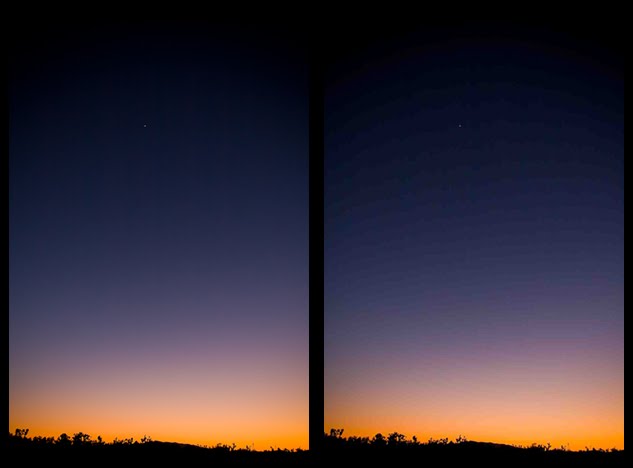
In the first image below, the transition is smooth from the oranges into the purples. In the second image (with higher compression) you'll see big blocks of color that instead of being many shades of purple have been lumped into a single color.
If the side by side comparison is too small to see the concept keep scrolling. I have included both files in a much larger size after the post.
(Note, this is a somewhat difficult concept to illustrate on the web because most blog platforms automatically reduce the compression on whatever you upload to save space. There will be some banding on the first image because of that. I tried to exaggerate the concept in the second image so you can see the difference.)


So there you go. Remember that once your camera creates a jpeg, it throws all the unused data away. Once you have tossed the transitional colors in this scene, they are gone. The image on the right is the best image you will get. My advice? Memory cards are cheap. Always set the highest quality possible and buy a few more.

Hopefully this little photographical tidbit has explained the mysteries of the universe.
This has been a fun series for me to write. I have tried to be thorough without being overly technical and/or long-winded.
I will keep it up as long as you all keep coming back, deal?


June 3, 2010

Photo IQ - Week 5 -- Focus and Focusing

Focus, people! We are getting close to the end of the series!
We are on part 5 of my 6-part series on what makes up Image Quality. Photo IQ.
Why, you ask, did it take this long to tackle something so basic as focus? I'm blaming global climate change.
Why bother talking about focus at all? It seems fairly obvious that when your subject is out of focus it will not be a quality image. True. But there is more to focus than just pushing the shutter button halfway down--although that is baffling enough for many.

How focus works:
The auto-focus system in today's cameras works on a simple principle. It evaluates the scene and finds areas of high contrast. By comparing the line between the light and dark portions it makes a decision on the point where the object has the highest contrast. Point and shoot cameras use the sensor to determine the focus of the entire image while DSLRs evaluate on a much smaller scale at many different points in the frame, that is why they are more accurate. If you want more detail on how these work, this is a great article.

This method typically works well until the light gets low and the camera can no longer discern between two different areas of value. At that point, the camera begins to hunt for focus and may eventually just stop.
In the dark when there is no contrast, your camera should have an option to fire a focusing flash. It may fire automatically or you can trigger it yourself. It fires a rapid succession of small flashes that allow the camera to find the contrast it needs.


Types of auto-focus:
Single Frame: The camera focuses when you push the shutter halfway down. It's the best option for subjects that probably won't be moving since when you reframe the shot the focus will already be fairly close and your chances of consecutive shots being focused correctly are higher.

Servo: The camera tracks the subject through the frame. It is one of the main reasons to upgrade to a more expensive camera since a truly effective servo focus is expensive and technologically complex. If you are going to shoot sports or anything that continually moves, you are a prime candidate for expensive cameras.

Hybrid: The different camera companies call it different things but it is typically single frame focus mode but the camera reserves the right to refocus if it detects that the subject moves. I rarely use the hybrid focus (AI Focus on my Canon) because I don't want the camera making the decision on what the subject is. If it's moving, I'll use Servo, if it's not, I don't want it switching focus on its own.

Auto focus options
Typically there are a couple options for autofocusing: Fully auto, and manually choosing a point.
It's typically more effective to choose your own focus point since the camera doesn't actually know what you want to focus on. It will typically focus on the front and center. If you're shooting past something you will almost always miss focus when you let the camera decide.
In a point and shoot you have much deeper depth of field because of the small sensor but the same concept applies. Most have a focus area of the screen that you can move around if you want to focus on something off-center. These days most p&s cameras have face-detection too, which is awesome. It searches for anything it thinks is a face and focuses there. It's quite handy and typically works very well. (My G11 even finds photos of faces that are minuscule.)

As far as Image Quality goes, focus is crucial.
Take the time to stop, brace yourself and squeeze the release. There is a lot of resuscitation you can do on missfire images in Photoshop but focus is not one of them. Trying to focus a missed image in software is mostly an exercise in futility. If your original file is big enough you can probably make it passable for web use but you simply cannot focus an unfocused shot after the moment is gone.
If you miss something, don't let it get you down. We all miss focus sometimes, especially when shooting with faster, riskier apertures. (At 6 feet away, f 1.8 and 50mm, the total depth of field is under 4 inches vs. about a foot at f4.)
If you are consistently frustrated with your focus, there are a few things you can do.
First, check your shutter speeds. A little bit of motion blur looks an awful lot like missed focus. Typically, if the focus missed, something in the frame will be in focus. If you can't find anything, perhaps you or the subject moved. I have seen a HUGE rise in the percentage of usable images since I started paying a little more attention to my shutter speeds. Often times we switch to aperture priority mode and just leave it while the light fades. Before long we are shooting at 1/30 or 1/20 of a second and the images end up blurred.
Second, same concept, different issue. The general rule is that you can hand-hold (not use a tripod) at shutter speeds equal to your focal length (lens zoom.) If you are shooting at 100 mm (3x zoom on a point and shoot) your shutter speed needs to be 1/100 sec or above. Don't forget to take into account the lens crop factor! If you are shooting with a standard aps-c sensor in a dslr (Canon 50d, 7d, Rebels, etc. Nikon d40, d60, d90, d300, etc.) you need to be at 1/150 for the same zoom. Image stabilization helps a lot so experiment at different shutter speeds to find out what your IS/VR will do.
Third, check your lenses for front or back focus. Sometimes a lens or a lens/camera combination isn't quite calibrated correctly. When your autofocus consistently misses there are ways you can test to see if it's a hardware issue. Some cameras allow you to actually adjust the focus plane to make your autofocus more accurate.
Here are a couple of methods to check out:
The complicated way
The less-complicated-yet-still-somewhat-complicated way
The second involves this graphic and the moire of your screen. Don't worry, it explains that too.


So what If you DO screw one up? Nothing can really fix bad focus but my method is pretty simple. Make it relative. I will often use a motion blur or lens blur in photoshop to put the REST of the image so out of focus that in comparison to it, the subject looks okay. It's not a perfect solution but it's about the only option I've found.

As always, I will delve more into these concepts as time goes on. Thanks for reading.
Feel free to let me know what subjects you'd like discussed in the future!

End of Line on week 5.

May 20, 2010

This is NOT a Racial Post! - WHITE BALANCE - Photo IQ -- WEEK 4

I am going to start out this way, if you want the cheapest, easiest way to make more professional-looking photographs, THIS is it. White balance is extremely important in quality images.
I hear people all the time lamenting their out-dated cameras and low-grade lenses, wishing that if only they could get better gear, their photos would look better. To all of you I say, don't upgrade until you master white-balance. It will give new life to your images.

What IS white balance and why do I care?
White balance refers to the color cast given off from different light sources or picked up by light reflecting off various surfaces. It is measured in degrees kelvin. Typical temperatures of light are as follows.

Color Temp. Light Source
1000-2000 K Candlelight
2500-3500 K Tungsten Bulb (household variety)
3000-4000 K Sunrise/Sunset (clear sky)
4000-5000 K Fluorescent Lamps
5000-5500 K Electronic Flash
5000-6500 K Daylight with Clear Sky (sun overhead)
6500-8000 K Moderately Overcast Sky
9000-10000 K Shade or Heavily Overcast Sky

There is a range given because white balance is a very imprecise science when it comes to photography. It changes all the time with clouds and different colored light bulbs...in fact, very few lightbulbs are yellow enough to fall under the traditional tungsten range.

With film white balance was a matter of choosing indoor or outdoor film then using filters to equalize colors and remove a cast.
Digital is easier because we can switch whenever we want, set custom white balances, and in mid to higher-end dslrs custom-tune the temperature.

Why white balance?
Just pay attention to the photographs that really move you. They will very rarely have odd color casts. Our eyes are very good at compensating for white balance differences naturally so we don't usually notice it. That is why so many amateur photographers don't pay attention to it. But it is an elements that when it is done right will elevate your images even if viewers can't put their finger on the reason.

RAW vs. Jpeg
Shoot Raw. Okay, just kidding, you can choose what fits your style better, there are still a few photographers that shoot jpeg out of the camera (See Jerry Ghionis) but more and more the consensus is to shoot raw.
If you don't get it right on location, any editing you do later on is simply photoshop's guess as to what it should be. I prefer to shoot raw so the original data is preserved. Then in editing the program knows exactly how the color should be rendered with each tweak of the white balance slider.
If you are a jpeg shooter, white balance should be your obsession, if you shoot raw, it is still a time saver since getting it right saves time in editing but you can miss or forget to change it and there is no harm done.

I went into the last couple of weeks of shoots to find examples of white balance shifts so you can see the difference between an average white balance and a good white balance.

Below is Christian Burridge at the Salt Lake County Democratic Convention. The convention was held in a large multi-purpose room lit entirely with florescent lights. You can tell they're florescent by the characteristic green tone in the auto white-balance example on the left. It's not bad, per se, but you can see the difference in skin tone when the compensation was introduced. It's a much more pleasing, more professional-looking image. I love shooting men in suits and white shirts because white shirt collars are just about the best sample for white balance. They are minimally reflective and are near the face so they are almost always included.


The next example comes from an underwater set. Again we see the influence of the mostly florescent lighting. The corrected image (right) is much crisper and cleaner.


The next example is from a set I did with hiphop artist Kosha Dillz. I was there to assist the amazing Andrea Hanks but she let me do a little shooting on my own as well.
The cloudy, twilight sky (oooh, he said Twilight!) gives a naturally blue cast but I was mixing in a daylight-balanced flash. I actually wanted to warm up the skin tones so I moved the white balance towards yellow by shooting on the Cloudy setting. The goal was to warm up the whole scene and really pull out the yellow in the little sunlight left. I think that "true" white balance is not always the ideal. I like things a little warmer than normal. "Correct" white balance means neutral--and neutral is, well, neutral. It can feel very clinical and unemotional. I almost always cheat a little warm, especially when it comes to portraits. Typically, "correct" skin tones on men are too pink for me. Skin tones look much better warm than cool. The corrected white balance is on the right so you can see the difference and judge for yourself. 


So how do you set white balance?
Every camera is different but typically you go into your menu and choose the one that is closest to your conditions. Some preset white balance settings are good. some really aren't. Auto white balance typically works pretty well and is a good choice most of the time but will be fooled by scenes where there is one dominant color, such as a frame full of autumn leaves. The camera will see an overall red/orange color so it will compensate by moving the temperature towards blue. I keep my camera on daylight/sunny balance most of the time. By NOT using auto white balance I at least have consistency in my images and if I need to correct them I can often apply the same correction to many images, saving me time. That only works in a situation where the color cast is consistent. I will go to auto if the white balance is changing often.
The Kelvin temperature comes into play when the preset values don't work. For me, this is almost always in an artificial incandescent situation. MOST tungsten/incandescent presets are too blue because they use the same temperature settings that have been used for years and years. The problem is that we aren't using the same bulbs we've used for years and years. Light bulbs have moved closer to daylight temperatures so often the tungsten setting will be overkill and be too blue. I keep my Kelvin selector at about 3100 degrees so I can flip over to it when the tungsten setting doesn't work.
Custom white balance is set by shooting a frame of a neutral colored subject then telling the camera that whatever is in that particular frame is the base neutral color. The camera then calibrates that color as neutral and bases all the other colors on that neutral example. For setting custom, gray is actually used more often than white.
I will cover using custom white balances for creative effect in a future Photo IQ post. It's really fun.

In this Photo IQ series I have tried to give a general overview of concepts that contribute to Image Quality. I can't cover everything and have tried to keep them like a woman's skirt, long enough to cover the subject but short enough to keep things interesting. I will expand on some of these concepts in future posts. Feel free to comment or email me with question or suggestions for topics. I've already gotten some great requests!

I hope you're enjoying the series! I have had a good time writing them and have had amazing feedback so far. Thanks for reading!

Next week's Photo IQ: Focus.

May 13, 2010

Photography--EXPOSED! - Photo IQ - WEEK 3

Yet again, I have bitten off a huge chunk of photographic goodness and I will chew it up and hand it back to you in nice, pre-masticated, understandable bite-sized pieces.

How does exposure affect image quality? That is the question of the day...or the week.
Exposure, simply put, is the amount of light that the digital sensor (or the film) absorbs. It is determined by three things:

1. The length of time it is exposed to the light. Measured as Shutter Speed
2. The amount of light that comes in at once. Measured as Aperture

3. The sensitivity of the sensor (or film.) Measured as ISO

The Analogy:
Imagine your sensor (I'll stop saying film every time, you know who you are.) is a bucket. Like this one that my wife Lori uses to put flowers in before she builds the most beautiful wedding bouquets on the planet. (How was that for a shameless plug? You really should go to her website, though.)


Your light meter/camera meter gives you the proper exposure, visualized by a line on the side of the bucket. We'll say that it is 2 liters. That is the correct amount of light/water for the scene. You have two factors that go into filling the bucket. How much water you pour in at once, and how long it takes you to pour in the water.
In the end, it really doesn't matter whether you dump the entire 2 liters in at once or whether you run a hose and fill it up slowly. In the end, you still have 2 liters of water in the bucket.

Think of the amount you dump in at one time as the aperture and the length of time it takes you as the shutter speed. Keep the analogy in mind as we go over the parts.


How do you measure light?
We do it in "stops". Stops are not nearly as difficult as most people make them out to be. One stop up is double the amount of light and one stop down is half. Pretty simple.

1. Shutter speed is measured as a fraction of a second, 1/8, 1/60, 1/1000. Half the amount of time, is one stop different. It's one stop brighter (double the light) when you move from 1/125 of a second to 1/60 of a second. The standard stop measurements go from 1/60 up and down, ex 1/30, 1/15, 1/8. 1/4 and 1/125, 1/250, 1/500, 1/1000, etc.You can see how each is either double or half the amount of light of the one above or below it. Modern cameras allow either one or two increments in between each full stop--it can be more confusing, many photographers don't even know what the official stops are.
There are no absolutes with shutter speed because how much light you get in that amount of time is based on how much is available and how much is coming in at once.
Shutter speed affects Image Quality mostly by controlling movement. If you shake the camera or your subject moves while the shutter is open, the image comes out blurry. Both the camera and the subject will move much less in 1/500 of a second than they will in 1/8 of a second. Typically, faster speeds will yield crisper, sharper images. With image stabilization on lenses photographers often just make a blanket statement that now that camera shake is minimized they can shoot at very slow shutter speeds. True, but you have to be aware that your subjects, be it people, animals, or even trees, move.


2. Aperture is measured in f-stops. It's a complicated equation (and a whole different blog post) to get the numbers but it boils down to each number being double the size of the one below it--therefore letting in twice as much light. (starting to get the pattern?) The traditional standard stops are 2.8, 5.6, 8, 11, 16, 22 etc. Each is one stop different from the one next to it. Again, modern cameras allow you to choose whether you want one or two options for apertures in between these standard ones.
The difference between aperture and shutter speed is that an aperture is always the same amount of light. So 2.8 on my 7D is the exact same amount of light hitting the sensor at one time as 2.8 on my G11 point and shoot. Remember that, it makes using flashes MUCH easier later on.
The main effect on Image Quality from aperture is depth of field. It's an amazing artistic tool but if you want a 3-foot-deep object entirely in focus and you're shooting at 1.8 and 50mm, you're looking at about one inch that will be in focus. Typically it takes 5.6-8 to focus an entire group of people 3 lines deep.

3. ISO is not really reflected in the bucket analogy. If you have ideas on how to use it, let me know. I toyed with using it but it just complicated things.
ISO is basically the measurement of the sensitivity of the sensor or how quickly it absorbs light. In the good old days of film, ISO was determined by the film you used. It was difficult to change film in the middle if you were outside using 100 iso film then went inside where you would need 800 to get any light at all. Digital is awesome. Now all you have to do is switch the sensitivity to wherever you want it.
ISO effects Image Quality with noise, mostly. The higher your ISO, the faster shutter-speeds you'll get, but with that extra speed you pay the price in noise. Not all noise is bad. I actually like the texture you get from a little noise, the question is what kind of noise. Vast improvements have been made in the look and feel of noise at higher isos. For example, I hated anything above 800 iso on my 40d but even though there is still quite a bit of it at 6400 on my 7D it is more pleasing and I actually mind it less. It doesn't interfere with the shapes and lines in the image like the ugly digital-looking noise did before.
Frankly, images will almost always look better at higher isos and correct exposure than they will under-exposed at lower isos.


That's basic exposure. The simplicity is maddening.  I will expand on all of these as time goes by.

Next week: White Balance...my arch nemesis.

May 6, 2010

Lens Quality - Photo IQ - Week 2

There are a lot of lenses out there...a lot. How do you decide which to buy and what the heck the difference is?
Famed wildlife photographer and prolific podcast czar Scott Bourne always says that photography is about compromise. Nowhere is this more evident than when dealing with lenses.
THE perfect lens, doesn't exist but YOUR perfect lens might.
(Scott Bourne also says that 99% of lenses are better than 99% of photographers but I digress.)

Lenses for Digital SLRs range from about $100 all the way up into the thousands of dollars. For the most part you get what you pay for but there are options no matter what your budget.
The main goal of any lens is sharpness. You want to get a lens that will be sharp at the sizes that you are printing. The smaller you print, the less you need something ultra-sharp.
For quality, I would definitely choose a more expensive lens with a lower cost camera than vice-versa. Think about it. If you have a $7000 camera but put a $100 lens on it, your photos can only be as sharp as the lens is! The other advantage to investing in lenses is that they can move up as you upgrade to a better and better camera.

So let's dive in.

The factors that contribute to price are:
1. Build quality
2. Complexity
3. Size
4. Features

1. Build Quality.
    Professional grade lenses (with Canon it's the ones with red lines around them) are built tougher. That doesn't necessarily mean durability, although that factors into it too, cheaper lenses are often made of plastic versus metals and other composites.

Mechanically, higher quality lenses have internal focus and internal zoom. When a piece moves in and out it is difficult to seal effectively so there's room for dust to invade the internal workings of your lens. The push and pull also tends to suck the dirt in. Internal movement means that all the physical movements are encased in the lens. It doesn't physically expand outwards either to zoom or to focus. It's more complex to build (That's number 2) so that makes it more expensive but it also allows for better sealing. If you often shoot in dusty or dirty environments you'll ruin less sturdy lenses by getting sand inside them. Even with normal wear and tear you'll most likely get dust in your lenses if they have external movement but that isn't necessarily a problem for casual users since it typically doesn't have a great effect on the quality of the photos you're taking.
The other factor of build quality is the simple quality of the glass used in the lenses. Here again, you can't really fake it--better is better.


See how the barrel moves out of the body.


Where this lens stays the same size regardless of the focus or zoom.


2. Complexity.
   The more parts and engineering it takes to create a lens, the more expensive it will be. This is an area where you can REALLY get quality for a steal.
At the consumer level, you often see lenses with huge zoom ranges like 18-300. It's really handy to not have to switch lenses but mechanically, it's impossible to have the same quality with that kind of complexity. In the move from a wide angle like 18mm to a long telephoto like 300mm it is very difficult to control the refraction of light. You'll rarely see pro-quality lenses with those ranges because you simply can't maintain high quality throughout the length of the lens. There's more leeway in a zoom from 70-300 because it doesn't have to pull double duty as a wide-angle as well. So just know that with the convenience of a single lens comes a sacrifice in image quality. Which leads us to...primes.
This is where you can really leverage your money and get high-quality glass for a much lower cost.
A prime lens is a lens that doesn't zoom. It is a single focal-length--a common choice is 50mm. With no mechanics at all for zooming, you get a much simpler, cleaner lens with fewer elements driving the cost of design and manufacture down considerably. Many high-end photographers use nothing but primes because the light is so much more controlled and less diluted...and in a prime lens you can get much, much better lenses for so much less $$$! Most pro series zoom lenses run about $1000-$3000 while quality primes run $300-$800.
Even at the low end you'll get much better lenses for less money.
When I first started, I bought two $100 lenses, the Tamron 70-300mm f4-5.6 and the Canon 50mm 1.8 prime. Both were made of plastic.


I used the 70-300 zoom for about a month before I realized that the quality simply wasn't good enough while the 50mm never left my bag until a few months ago when I was shooting with it for fun and the camera was stolen. (I have missed it.) You simply can't make a 70-300 zoom with any quality for $100 but that prime was sharp as a tack! (I won't go in to f-stops now but you also get 4 times more light at the same shutter speed with the prime.)

3. Size
   Size matters here too. The bigger the front opening, the more light that gets in at once. You'll see consumer lenses with diameters of 52-58mm. You can only get so much light in those at one time. As you get larger, (77mm is standard for most pro lenses), you get much more light but you also get much more expensive, larger pieces of glass. It also becomes far more expensive for filters.
Size doesn't have a large impact image quality, just cost.

4. Features
   Features definitely affect image quality. Image Stabilization (Nikon calls it VR, Sigma-OS, etc.) is a very common feature these days and can be a huge help in controlling motion blur, especially in low light. IS basically uses a gyroscope and tiny motors to compensate for your shaky hands by moving the lens elements the opposite way of the shake. It helps.
Other features include:
- Lens Coatings: layers of stuff coating the lenses to control lens flare and that ugly purple, blue, and red fringing you get in high-contrast situations. Definitely affects the quality of your images. It's not fun to take out and higher-end lenses give you much less of it.
- Ultrasonic Focus Motors: Uses vibration to auto-focus instead of moving motors. Doesn't really affect image quality directly but quieter, faster, more efficient auto-focusing is definitely going to get you better photos, especially of moving subjects like children and athletes.
- Tilt-shifts: Lenses designed to change the plane of focus to compensate for perspective, usually used in architecture but also can be very creative and dynamic for portraits. For examples of tilt-shift in portraits check out Julie Parker. She's great.
- Auto-focus override: Typically used in sports, it allows you to manually move the focus and override what the camera chose without changing the focus mode to manual. It's quite complicated mechanically. Personally, I never use it but I'm sure it's indispensable for somebody.

So there you go. Hopefully this info will help you make an informed decision on what is really one of the biggest factors in Image Quality.
Next week's topic? Exposure.

April 29, 2010

Photo IQ - Week 1 -- Sensor Size and You

One of the comments that I hate more than anything when people see my images is, "You must have a really nice camera!" The implication is that the only thing standing between an amateur and a professional is the cost of their equipment. In picking a teammate for basketball, would you choose LeBron James or my uncle Earl? What if Earl had better shoes on and a nicer basketball? Yep, still LeBron. While there is a huge body of knowledge, skill, and experience that separate a true professional from an amateur, I admit that yes, I do have a really nice camera...and yes, it does make a big difference.
Here's why:
First humor me as I define the two types of cameras we're talking about here.
A "point and shoot" is the standard compact camera that makes up 80% of the cameras people carry around with them. They're designed to be compact, inexpensive, and easy to use. Most digital point and shoot cameras are designed to be used by framing the photo on the LCD on the back of the camera, many don't even have physical viewfinders anymore. Digital point and shoot cameras also have very few moving mechanical parts.
Here are some examples of point and shoot models:
pas
pas

A DSLR or Digital Single-Lens Reflex camera has interchangeable lenses, a mechanical shutter, and are designed for image quality, versatility, and speed. Despite recent changes, most photos with a dslr are taken while looking through a physical viewfinder.
DSLRs look something like this:
pas>

From the advent of digital cameras we have been conditioned to look at pixel count as the sole statement of quality on the cameras we buy. For years all camera marketing was geared towards more and more megapixels...at least until October of 2009. In October of last year Canon released their G11.

g11

The latest in their flagship point-and-shoot line had one very interesting difference from the G10, its predecessor--5 million FEWER pixels!
Whaaaaa?!? As your entire photographic world comes crashing down, realize that there is a method to Canon's madness and it leads us into the heart of today's issue.
The megapixel race is over.
Pixel number determines the physical size of the image, not the quality. 10 million pixels is around 3888×2592. To translate that to a full-resolution print it equates to capturing an image that is 13x8.5 inches. This means that anything you print smaller than an 8x10 you actually have pixels you don't even need. I've printed picture-perfect 30x40s from 10mp files. All cameras with 10 mp will print essentially the same sized image at full resolution.
The holy grail of megapixels was always 8. Eight million pixels is the basic equivalent of 35mm film so anything you could do with a 35mm negative you can do with 8 megapixels. That is the reason most camera makers have held at around 10.
The size of that standard 35mm frame of film is still the standard when it comes to sensors. A "full-frame" sensor refers to a sensor that is the same size as the classic 35mm negative. Typically, digital equipment is still measured in comparison to that standard.

The device on a sensor that captures the data is called a photosite. There's one photosite per pixel therefore if the camera has 10 million pixels, then it effectively has 10 million photosites.
The problem is that as you pack more and more photosites onto a sensor they need to get smaller and smaller and must be closer and closer together. This doesn't make a difference in size on your computer or in a print. (Pixels on your monitor are the same size and spacing regardless of the size of the original.)
Larger photosites absorb more light in the same period of time so they have more color data to work with and more dynamic range so colors are truer and stronger. Shadows become deeper and highlights keep detail in more extreme conditions. More contrast means clearer details and more depth to the image. Also, when the sensor is hit with electricity, the closer the photosites are to each other, the more heat is generated. Heat affects the way the photosite records data and translates into noise in the final image. So to go back to the G11, by only putting 10 million pixels on the same area that previously had 15 million you can have larger and more spaced--meaning cooler--photosites. That all comes down to better low-light and high ISO performance. Canon had decided to sacrifice quantity for quality.


What about my camera? I'm glad you asked. Below is a diagram of the typical sensor sizes for most of the cameras on the market:
I have removed a couple of the less-common sizes for ease in understanding the drawing. This diagram is not actual size but you can see the huge differences in the size of various sensors. (Actual size is further down.)

Sizes

For the purpose of visualization, we will imagine that each sensor has 10 million pixels on it. It is easy to conceive the difference in the size of the individual photosites between the different sensors.
The smallest sensor, the 1/2.5 (That means the diagonal is 1/2.5th or 0.4 of an inch) is the standard sensor for point and shoot cameras--about 80% of the cameras you see. Our example above, the G11 has the 1/1.7 sensor (or .6 of an inch diagonal.) That's the same 10 million pixels but they have a full 50% more space than the average point and shoot.
You get out of point and shoot models into the four-thirds system in cameras such as the Panasonic and Olympus 4/3 DSLRs.
By the time you get to the standard APS-C sized sensors in the majority of the Canon and Nikon DSLRs you have more than 13 times the sensor space for those same 10 million pixels. At Full Frame you are looking at 2.5 times the size of the APS-C and 35 TIMES the size of the standard point and shoot!
Another aspect of sensor size is the ability to shorten the depth of field to blur the background and get the beautiful soft background that is characteristic of professional portraits. To get the same depth of field at 100mm and f2.8 as a Canon 7D with an APS-C sensor a point and shoot must be at f0.8 which simply isn't possible and would be extremely expensive to make if it was.

If you're curious about the ACTUAL size of the sensors, they would be about this:

actualsize
 (Note: Cell phone camera sensors are much smaller than even the smallest sensor on this chart so hopefully that helps you understand why mobile phone cameras are so...uh...basic.)

To illustrate the concept, I've attached three photos from three different cameras with three different sensors.
These are each a pixel-to-pixel crop at 100%. All were shot at 10 mp and 800 iso. (800 ISO was chosen because it is a common choice for the auto setting in all three cameras and the differences are clearer at that sensitivity. All three sensors would look better at lower ISOs)


Canon Elph SD1100 - 1/2.5 Sensor (Standard Point-and-Shoot Sensor)

1/2.5

Canon G11 - 1/1.7 Sensor

1/1.7

Canon 7D - APS-C Sensor

APS-C

The noise difference is apparent as is the color saturation and the contrast. The last image is clearer, cleaner and has more depth to it.  
What do we learn from all this jargon and mumbo-jumbo? We learn that as a start in determining Image Quality, equipment matters. A valid way to take technically better photos is to spend more money. With that out of the way, in the rest of this IQ series over the next few weeks we'll discuss ways to improve your Photo IQ that you can apply on any camera.

So to sum up, this is your image...and this is your image on APS-C. Any questions?

For more information about exactly how all of this works, here is some homework:
http://www.cambridgeincolour.com/tutorials/digital-camera-sensor-size.htm
Related Posts with Thumbnails

Random Web-related Links

Jon Woodbury Photography

Jon Woodbury Photography is the choice for artistic, personal photography.

Visit Jon Woodbury Photography at OneWed.com & read a review of this wedding vendor & others.

http://alphainventions.com

blog directory